Microsoft Fabric Tutorial: How to Use Dataflow Gen2 for Data Transformation
This is the second video in a 3-part Microsoft Fabric basics tutorial series, where we will show you to use Dataflow Gen2 for data transformation. In my last video, I talked about how to create a lakehouse and create shortcuts in Microsoft Fabric. We established a lakehouse and its sequel analytics endpoint. Additionally, we developed a report using the semantic model derived from the ingested objects. The data originates from a workspace via a shortcut, which means no data is physically written to the lakehouse. This reference allows us to visualize objects at the analytics endpoint. We utilize SQL Server Manager and Tabular Editor for data analysis. We created the semantic model with referenced objects and developed a report based on it.
In this video, we’re going to pick up where we left off with some of the objects we brought in and how we can use the Data Flow Gen2 tool for data transformation of a messy Excel budget file.
The final step involves displaying the transformed data in the table section to update the semantic model in a report. This procedure enables the integration of ad hoc data into the reporting alongside the company-managed data previously incorporated via shortcuts.
The following sections summarize key concepts covered in the video. click the timestamps in each header below to link directly to step-by-step instructions for each component.
Loading Data into Fabric 2:36
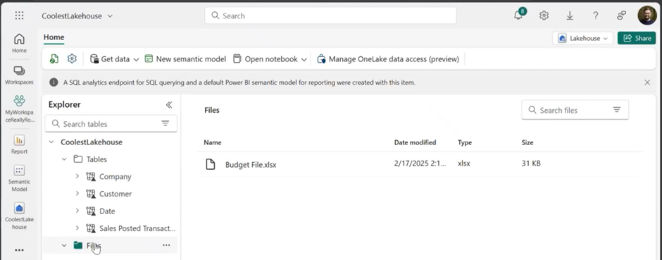
The first step is preparing to import a file into our lakehouse. The unstructured data section contains a sample budget file that includes customer names and sales targets. This file is structured as a matrix with totals, which presents certain challenges for use in a semantic model.
Excel can sometimes be problematic for modifying files like this due to its opaque nature. Tracking changes and applied logic can be unclear, particularly if the individual who created the file transitions to another role.
Leadership at larger organizations often prefer alternatives to Excel for larger reports, which is where Fabric becomes valuable.
Start by uploading your file to Fabric.
If the file already exists, you may opt to rename and reload it or overwrite the existing one. Overwriting is beneficial when external changes have been made to the budget file, and avoids the complexities of merging multiple files.
Next, we will need to transform this data.
Data Transformation in Microsoft Fabric with DataFlow Gen2 (4:55)
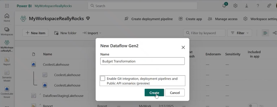
Open Fabric’s transformation tool called Data Flow Gen2. This tool allows users to prepare, clean, and transform data efficiently.
First click on “New Item” from your workspace, then click the Dataflow Gen2 tool and name your data flow.
In my example I called it “Budget Transformation.”
Now we have our Power Query window open. There are multiple methods to bring in data. For instance, we could upload our data to our lakehouse. Alternatively, if it had not been uploaded, we could import it directly here. However, I prefer keeping all data within the lakehouse whenever possible.
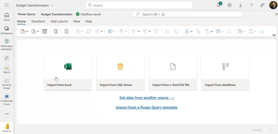
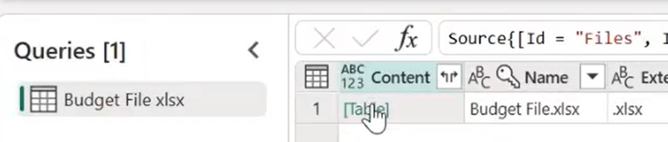
Next, we select a data source from our lakehouse, which provides access to available objects. We can choose either tables or files. Previously, we brought in certain tables, but we also have files. By opening a file, such as our budget file, we can begin our transformations.
Note that this process may take some time.
Fixing Data Formatting Issues in Fabric
By selecting the hyperlink from the table, we can view our data. In my example file there were several issues mimicking what you might deal with in your day-to-day, like extra rows and columns.
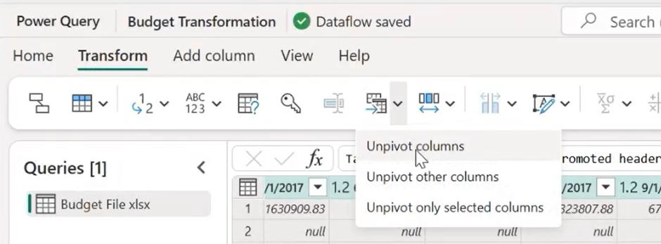
You can easily edit or remove columns and rows. In my example I promoted the first rows to headers, resulting in a more structured format.
In my example file, the primary issue was the matrix format of dates and values, which we prefer in a data table format. This can be resolved by unpivoting them. To do this, select the required columns and use the unpivot column feature in the transform section to convert attributes and values into rows.
To match our table, a date key is needed. I select a date, the date attribute, and then add a column. I chose the option to create a column from examples based on the selection. By typing in the desired format, Fabric generates a formula that applies the specified business logic.
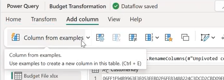
For instance, the date key format may require the year followed by the day, such as 2017. Fabric will then attempt to transform the date column according to the provided examples.
Now, In Excel, deleting a source column for a formula can cause issues, but this does not pose a problem in Fabric, allowing access to just the necessary data.
And now we have a date key, a customer key, and a budget amount. These will help you leverage some of the dimension tables that are available.
Landing transformed data in Fabric (10:23)
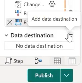
Now you’ll choose where the data will land. In my example it will be in the lake house. Use the default connection provided.
Find your workspace and select the lake house to save in. I named it “budget 1” for simplicity.
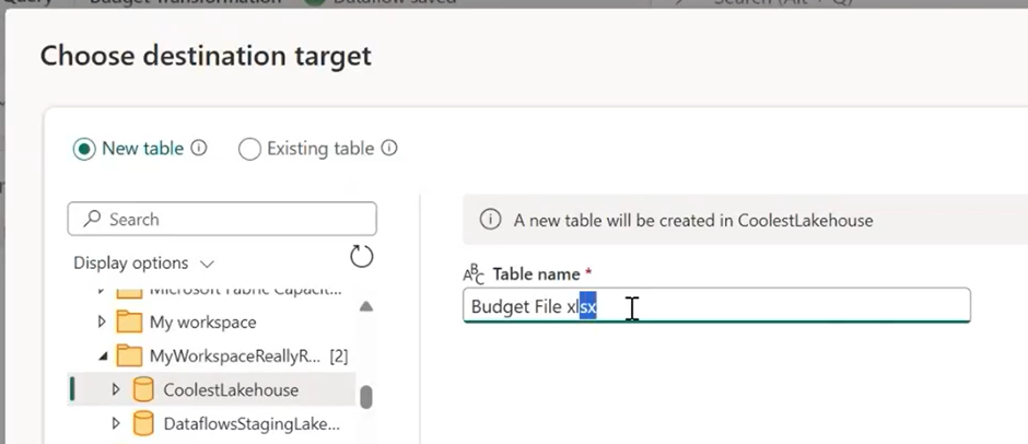
Check the source data types and how they appear in the destination. Save settings, which takes a minute.
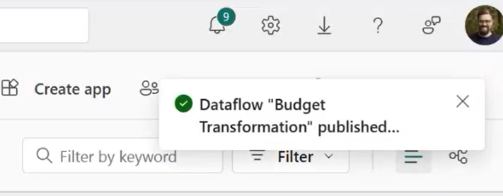
When published, the output saves to the table in the lake house. A flag on the top right indicates the data flow has run.
Pro Tip: Do not use Data Flow Gen1 as it won’t land your output in the lake house. Always use Dataflow Gen2 for such data transformations. Learn more
Make sure to hit refresh often, and you can see our budget 1 starts to appear.
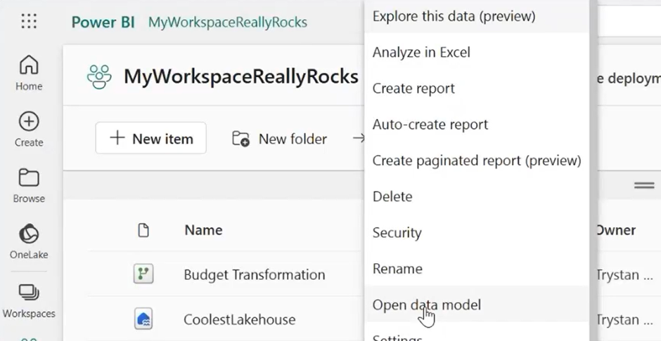
Next, navigate to the workspace to find the semantic model. We’ll bring in the new table and compare it with the organizational data. In editing mode, we’ll locate the “budget 1” table.
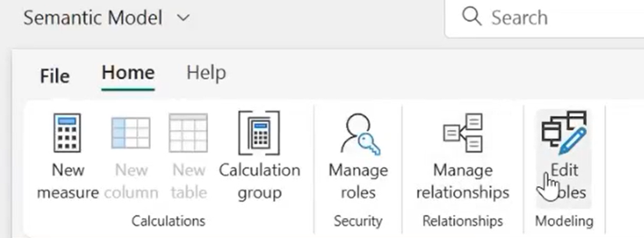
To add new tables into our semantic model (created in the previous video), you can use this option to add or remove tables. Budget 1 is now included.
Match the customer key with the fact table to the dimension table by dragging the date key to the date table. Always drag from the fact table to the dimension table to ensure proper relationship direction and cardinality.
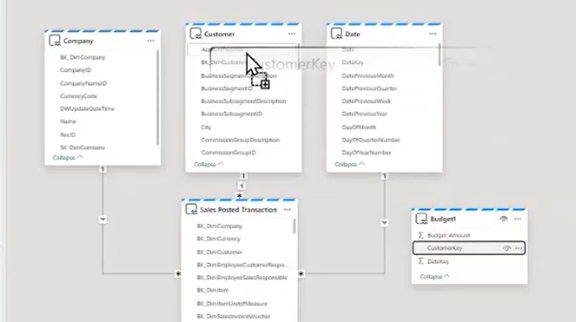
Now that the tables are added, refresh once more.
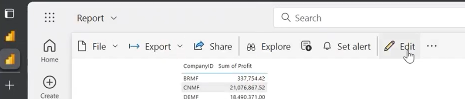
In the report, click edit. You’ll see “budget 1” already included. Create a new page using the “start of month” field. Use this with the sales amount from the fact table to display sales over time. Add the 2017 budget.
Create a case statement to filter unnecessary information and hit apply. This lets you compare the budget amount with the sales amount, showing any differences at a detailed level.
Hover over data points to see specific budget versus sales amounts, noting instances where sales are lower than the budget. In my example, I removed a month to show the difference. That’s it!
Conclusion and Next Steps – Connecting Transformed Data Sets
To recap, we combined messy, unmanaged data with clean, managed data. We summed sales from the fact table and dimension tables from our “OAFSCM” Fabric production workspace into our lake house. We also used a budget transformation to bring more info into our lakehouse. This allowed us to access both structured and unstructured data and model them together for reporting.
Using this data transformation, we turned messy data into something useful for analytics.
In the next video of the series, I’ll show you how to connect this newly transformed data set to the Semantic model we created in part 1 of the series.
For more hands-on experience with Microsoft Fabric and Power BI, register for one of our free workshops we host twice a month: